Aus post
The Last Group
Project description
The Last Group's project is a mobile app designed for users to be able to do most of the work of sending an item with their personal device, rather than having to do most of it in an Australia Post office.
Design challenge
“How might we use existing and upcoming technologies to re-imagine the sending experience for everyday people like you and me?”
Currently, Australia Post's sending experience leaves a lot to be desired, particularly for customers and their use of the in-store self service kiosks. Self service kiosks are available in some major Australia Post offices.
Design response
With the key factor of the sending experience in mind, we wanted to create a brand new experience for customers to be able to use. There were some approaches to this, such as the use of modern drone technology or simply integrating the self-service experience into a more familiar platform; the mobile phone!

Research
Research
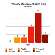
We conducted our initial research in 3 different methods: A survey with 24 responses, observation of 15 different customers using the self-serve kiosks at Australia Post in Elizabeth Street, and interviewing 5 people.
Key findings
Despite the presence of helpful staff, customers do not use the self serve kiosks primarily because it's either unavailable in their nearest post office, or they don't see the need to use it and the most common system being direct customer service suits their needs just fine. During the observation period, some customers were also seen struggling with using the kiosks and required the staff for help and guidance.

Understanding the
Sending Experience.
Empathy maps
How does a person feel
when visiting Australia Post?
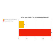
Based on the primary research we conducted, we found that customers of Australia Post mostly prefer to wait in line to use the direct customer service over using the kiosk, should it be available in the post office. Those that do use the kiosks generally use them to send letters & parcels. There is also influenced perspective that kiosks are difficult to use the first time, potentially skewing one's ability to use them.

Customer Journey - Research Stage
The journey map is based on one of our observation results. The tasks (including the microtasks) and the findings were used to identify points that could be applied to the solution.

What if we put the self-serve kiosk...
IN THE HANDS OF OUR USERS?

Refined concept
The general uncertainty when using a kiosk suggested that we could try to use a platform where customers can do the sending experience in a comfortable manner. Initially, our ideation revolved around a redesigned kiosk. Further brainstorming identified that personal devices are a prime example for customers to be able to feel comfortable with the sending process. However, because there won’t be staff assistance should we solve the design challenge with a personal device, we needed to make the sending process as simple as possible, only adding guidance for customers to be able to refer to where needed.

User Flow


Skip the in-store queue
ACCESS ANY TIME, ANYWHERE.
Low fidelity prototyping
We began our prototyping process with "paper prototyping", although it was drawn digitally. After sorting them out to identify the user flow, we proceeded to the low-fidelity prototyping, made with Adobe Illustrator to create the screens and Invision to form the prototype.

The kiosk experience,
MADE PERSONAL.

User testing
We conducted usability testing for both the low-fidelity and high-fidelity stages of the prototype. Changes were made based on feedback and responses during the tests.
Approach
In total, we conducted moderated & guerilla testing on three different people. The moderating technique used is Retrospective Probing, although eye and finger movement were also observed. Two of them consented to being recorded for reference.
We also did unmoderated and remote testing on 5 different people to get additional findings.
Activities
The user is handed out one of two primary scenarios. The first one is to use the app to send a parcel. The second one is to send a letter. Different extensions of the scenarios were applied to different users such as trying to send a small-sized letter to someone in a different Australian state.

Key findings
The participants were able to complete the activities without much of an issue. However all of the test participants showed signs of hesitation upon reaching the final part of the flow that is obtaining the bar code. The bar code system is a critical part of our solution because users need it to complete the task of sending items, so it was the top priority to address for the high fidelity prototype.

Help us
help the environment.
We care about the planet. Information about your parcel size is used to calculate the most efficient way to pack, store and distribute mail to minimise our carbon footprint.
Don't know the dimensions of your parcel?
No worries! Your VR camera can calculate that for you!
High fidelity prototype
With the low-fidelity testing results in mind, we developed the high-fidelity prototype with the following key changes, in addition to a major design update.
-
A tutorial is added to guide users with the usage of sending items. First-time users will see the tutorial before they can use the other app features, and it will be accessible at the landing page of the sending screen.
-
Unpaid and paid transactions, saved as bar codes in the screen underneath the link to send a letter/parcel
-
A simple sentence to guide what users must do with the bar code at the end of the sending process
High fidelity user testing
From the high-fidelity usability test, we found that the user flow has only improved slightly. The barcode is more understandable, evidenced by the user’s ability to guess partially what to do with it. We also noticed that users click on the two barcodes in the beginning of the screen instead of sending an item. We iterated from those points of feedback by being more clear with the text guide on the barcode screen as well as swapping the positions of “send item” and the barcode history so that users would notice the “send item” button first.
Journey Map - High Fidelity Prototype


Designed today,
Optimised for
tomorrow.
Project outcomes
To recap, our project is recreating the sending experience at the comfort of the user's own personal device. We designed a mobile app that functions similarly to the self-serve kiosks in regards to sending letters and parcels.
Project challenges and limitations
-
The bar code system
This is a system that we implemented in order to create a self service experience that can be done on a personal device. Most of the user's pain points during the testing revolved around this. The initial usability test allowed us to iterate on this by adding current transactions for ease of access, and adding a simple text guide to direct users what to do with the bar code at the end of the journey.
-
Australia Post's system
For the most part, we do not know the full extent of how Australia Post handles their sending system. We did use the kiosk ourselves to get a better understanding of how the self-service sending experience works, as well as asking the visiting AusPost representatives for some insight. The app is designed as close to the existing system as possible, keeping the project outcome realistic.
-
Determining non-prepaid item weights and sizes
Though users can opt to not input the parcel weight and instead get the correct weight (and label) by taking the bar code to Australia Post, they have expressed concerns what if they estimated the weight incorrectly. The current sending system already prompts the receiver to pay extra if the label is inconsistent with the item's size or weight.
Key outcomes and insights
Most users are interested in the idea of being able to do the sending process on a personal device. However, there was one particular criticism where at the end of the day, the user still has to go to the post office in order to complete the sending process. This is what one of our brainstormed solutions could have solved, with the use of drones to assist with the sending experience. However, we needed to keep the project in a realistic scope, considering that the design challenge has to address everyday people, who do not necessarily have access to new technologies.
Meet The Team

Brielle Clasby
Project Manager
Project planning, execution and completion, milestone presentations, web design, infographics and illustration

Adi Baskara
Research Lead
Project supervision, research, surveying, gathering web content

Julius Shen
Prototyping
Low fidelity and high fidelity prototyping

Jerry Zhao
Prototyping
Low fidelity and high fidelity prototyping

Maheshwari Iyer
User testing
Low fidelity prototyping, interviews, user testing


